4 Common Colour Mistakes That Could Ruin Your Home’s Look

Selecting colours for your home can be an exciting yet overwhelming task. The right palette creates a harmonious and inviting atmosphere, while the wrong choices can leave a space feeling off-balance—or even unwelcoming. If you’re planning a refresh, a little foresight can save you from costly repainting (or worse, regret).
Nordic paint brand Tikkurila highlights four common colour mistakes that could be ruining your home’s look.

1. Ignoring Natural Light
Natural light plays a huge role in how paint colours appear throughout the day. What looks like a warm beige in the store might turn into a dull grey in a north-facing room.
- South-facing rooms get plenty of sunshine, which can intensify warm tones. Cooler shades like blues, greens, or soft purples help maintain balance.
- North-facing rooms have cooler, indirect light that can make colours look duller. Warm hues—think soft oranges, earthy browns, or creamy yellows—can counteract this.
- East and west-facing rooms change throughout the day, so it’s best to test swatches and see how the colour shifts in different lighting.
A simple trick? Use large sample swatches and check them at different times to see how the colour behaves.

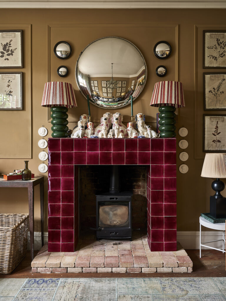
2. Pairing Colours with Conflicting Colour Temperatures
Combining warm and cool tones can create contrast, but without a cohesive plan, it can make a space feel disjointed. Imagine pairing a warm beige sofa with an icy blue wall—it might work in theory, but without a unifying element, it can feel mismatched.
To make mixed temperatures work:
- Stick to a dominant temperature (mostly warm or mostly cool).
- Use neutral shades—like greys, whites, or soft taupes—as a bridge between warm and cool hues.
- Introduce warmth through natural materials like wood or textiles if you’re working with a cooler palette.

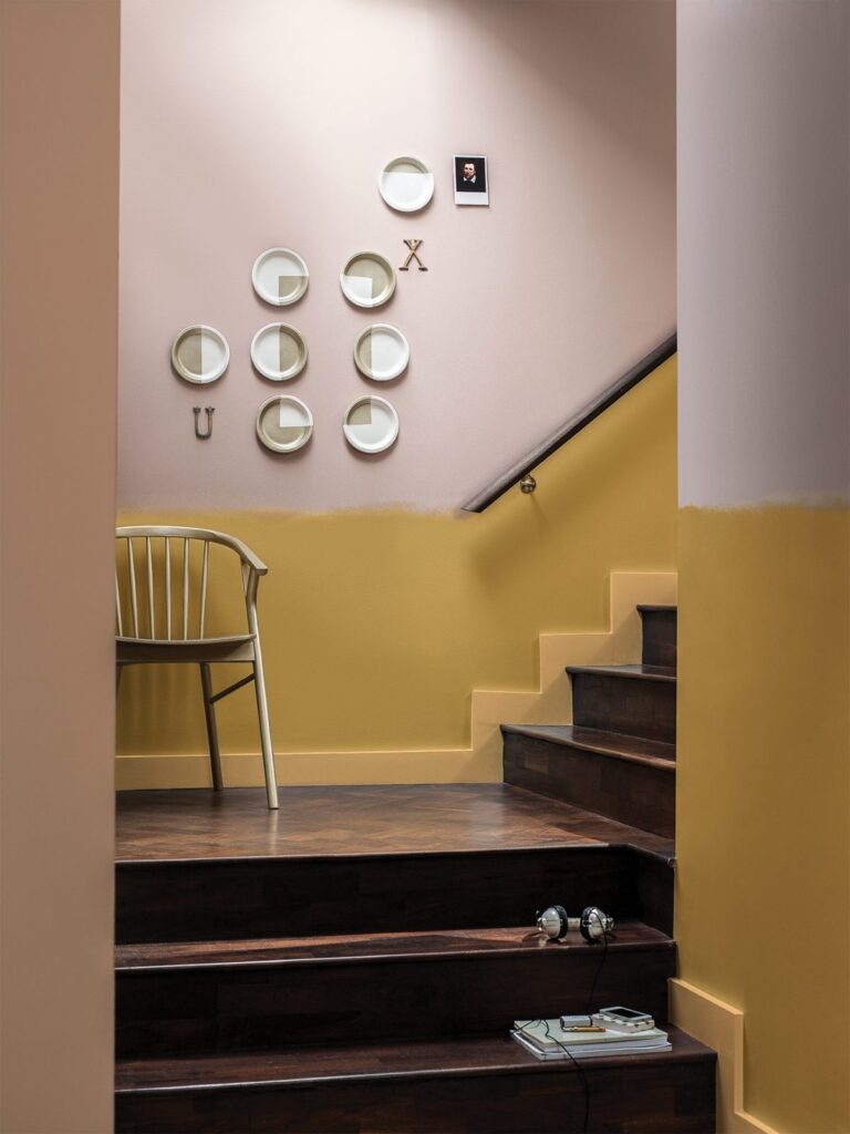
3. Overusing Dark Colours
Dark hues are dramatic and sophisticated, but too much can make a room feel small and heavy. If you’re drawn to deep tones, the key is balance.
- Use dark colours strategically, like for an accent wall, trim, or to define specific areas.
- Follow the 60-30-10 rule—60% of a room in a dominant colour, 30% in a secondary shade, and 10% in a bold accent (such as a darker hue).
- Consider lighting—if your room has limited natural light, balance deep shades with lighter elements to avoid a cave-like effect.

4. Choosing Colours That Don’t Suit the Room’s Purpose
Paint isn’t just about aesthetics—it influences mood and functionality, too. The colours you love might not always support the way you use a space.
- For a home office, energising shades like mustard yellow or a vibrant blue can boost focus and creativity.
- Living rooms benefit from warm, earthy tones that feel inviting.
- Bedrooms should lean towards calming hues like soft greens, muted blues, or gentle lavenders for better relaxation.
- Kitchens thrive with fresh, timeless shades like sage green, which brings a sense of calm while still feeling vibrant and inviting. It pairs beautifully with natural wood or marble countertops.
Trendy colours and bold statements can make a space feel fresh and unique, but the key is ensuring they still work with your lifestyle.

Creating a Cohesive and Inviting Home
A well-chosen colour scheme can transform your home, making it feel more cohesive and inviting. By considering natural light, maintaining a balanced colour temperature, using dark tones wisely, and matching colours to function, you can create a space that feels effortlessly stylish and comfortable.
Images courtesy of Tikkurila.
📌 Love these tips? Save this post to Pinterest so you can refer back later!
Save to Pinterest