Mocha Mousse: What Designers Think of Pantone’s 2025 Colour of the Year

Every year, when Pantone announces its Colour of the Year, I find myself caught between fascination and scepticism. These annual proclamations often spark a mix of professional curiosity and personal amusement. So, what are people saying about this year’s choice, Mocha Mousse?
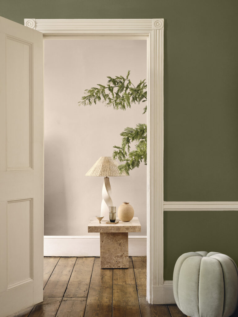
Well the first thing that strikes me about it is its quiet versatility. Described by Pantone as an ‘evocative soft brown’, the shade offers a departure from the more vibrant or unconventional colours of previous years. It’s a grounded choice, reflective of broader trends toward natural tones and a focus on comfort in design.
As always, opinions on the Colour of the Year are divided. Is it a meaningful reflection of societal moods and cultural shifts, or just clever marketing? To explore this question, I’ve gathered insights from a range of interiors experts. This post shares some of their thoughts and considers how Mocha Mousse might shape home decor and design in the year ahead.

Why Mocha Mousse?
According to Pantone, this rich, warming, brown hue was selected for its suggestion of ‘the delectable qualities of chocolate and coffee, answering our desire for comfort’. It’s a nurturing colour that evokes thoughtful indulgence, harmonious comfort and feelings of contentment. It also aligns with broader trends towards biophilic design, quiet luxury, and a collective yearning for simplicity
Underpinned by our desire for every day pleasures, PANTONE 17-1230 Mocha Mousse expresses a level of thoughtful indulgence. Sophisticated and lush, yet at the same time an unpretentious classic, PANTONE 17-1230 Mocha Mousse extends our perceptions of the browns from being humble and grounded to embrace aspirational and luxe.
Leatrice Eiseman
Executive Director Pantone Color Institute

Mocha Mousse Insights: What the Experts Say
Amthal Karim, Head of Design at Furniture and Choice, describes it as a “warm embrace,” tying the hue to the growing desire for homes that feel nurturing and balanced. Its connection to natural elements reinforces a sense of grounding, making it an ideal choice for interiors that prioritise comfort and connection.

Millie Heppell, from heating and bathroom specialists Renaissance at Home, is a big fan. She said: “I think Mocha Moose is an excellent choice, steering away from cooler tones and bringing warmth into the home.
“Almost a soft, warm beige, it will help create the perfect cosy and inviting atmosphere.”

Richard Haley, Creative Director of By Haleys, is a little more sceptical: “Brown has undeniably been a dominant force in fashion recently, so Mocha Mousse felt like a natural prediction.
“That said, I’m not entirely convinced this specific shade will establish itself as a flagship colour in its own right. Instead, I think the lasting impression will be that ‘brown’ will define the colour of the year, rather than Mocha Mousse.”

How to embrace Mocha Mousse in your space
James Mellan-Matulewicz, Creative Director at design brand Bobbi Beck, shares his insights on how homeowners can embrace Mocha Mousse to create intimate, indulgent spaces.
1. Start with the Walls
Mocha Mousse is an exceptional colour for walls, creating a sense of grounding that’s both elegant and comforting. If you’re looking to make a bold statement, use it throughout an entire room to envelop the space in warmth. Alternatively, opt for a feature wall paired with lighter, neutral tones on surrounding walls to maintain balance.
For an added touch of sophistication, James recommends pairing Mocha Mousse with crisp white trims or ceilings. If you want to lean into a more layered aesthetic, consider using textured wallpapers in complementary tones or incorporating natural finishes like wood panelling. These combinations will amplify the colour’s richness while maintaining its versatility.
2. Add Texture with Furniture and Textiles
When it comes to furniture, Mocha Mousse works beautifully as a statement hue. A velvet sofa or an armchair in this shade can become the focal point of your living room, instantly elevating the space. Its richness makes it an ideal choice for upholstery, offering a neutral base with enough depth to stand out.
If you prefer a subtler approach, introduce Mocha Mousse through soft furnishings like cushions, throws, or curtains. These accents can be layered with complementary colours such as cream, taupe, or even muted blush tones for a sophisticated yet inviting look. The key is to let the colour create a tactile, cosy atmosphere that feels indulgent without being overwhelming.
3. Use Mocha Mousse as an Accent
While this shade can dominate a room, it also works well as a complementary accent. Mocha Mousse is incredibly versatile, pairing seamlessly with both warm and cool palettes. For a contemporary touch, combine it with soft blues or greens, creating a dynamic yet cohesive design. Alternatively, earthy tones like terracotta or mustard can highlight its natural warmth.
In kitchens and dining areas, you can introduce Mocha Mousse through bar stools, painted cabinetry, or even tableware. These subtle accents allow you to experiment with the colour without making a full commitment to large-scale changes.
4. Create Tranquil, Personal Spaces
Whether it’s a bedroom or a reading nook, this colour adds a nurturing and grounding quality that enhances relaxation. To make the most of this shade, pair it with natural materials like linen or wool and keep the lighting soft and warm. This combination will amplify the colour’s calming effect, making it ideal for moments of personal indulgence and reflection.
5. Focus on thoughtful Accessories
Metallic accents—such as brass or antique gold—work wonderfully with this shade, adding a touch of understated glamour. Incorporate these finishes in light fixtures, picture frames, or mirrors to elevate your space.


What do you think? Are colour of the year announcements helpful design guidance or simply a marketing strategy? Are they truly a reflection of our collective mood? Does a colour have the power to influence our emotional landscape, or are we reading too much into a simple shade?
Does Mocha Mousse resonate with your current emotional state? If so, how would you incorporate it into your home?
Drop your thoughts in the comments.
Save to Pinterest