
Our modern minimalist kitchen extension

We finally completed the last few jobs on our new kitchen last month and I had planned to share the reveal with you, but then everything changed and I put off writing this post because it somehow just didn’t feel like the right time to post something as frivolous as a kitchen reveal.
I was worried that it would seem insensitive with everything else going on in the world at the moment, but more than a month into lockdown some of you have told me that you are glad of the distraction of the occasional interiors post to divert your attention from the news right now. Perhaps you’re planning a similar project yourself? Or maybe spending more time at home has prompted you to think about how you might make changes to your existing kitchen to make it work better for you? If so I hope you’ll enjoy reading our renovation story in this start to finish guide covering how we designed and built our brand new kitchen and dining space.
For a full overview of the project you might want to first catch up on a couple of my previous posts. In Part 1 I covered the initial planning process and in Part 2 I shared an update on the first phase of the project and posted some images of the shell of the build as we began the internal fit out. Today in Part 3 I’m excited to finally be able to share the finished space with you.


The background to our kitchen extension
First some background. When we moved in the house only had a tiny and very dated kitchen. It was barely functional, so one of our first jobs was to decide on a design for a new kitchen extension. This would involve demolishing an old garage at the side of the house and constructing a new side extension. We came up with the design concept for this ourselves and then hired an Architect to draw up the plans. If you’re curious to see the layout I shared the plans here.
The builders began work on the extension last January and completed the shell within about 3 months but then things slowed down a little as we took on all the internal work ourselves. It’s been a long process. Starting from bare plaster walls and a concrete sub floor we did pretty much everything that you can see here in the finished space – from plumbing to fitting the cabinetry, to laying the floor and fitting the window, as well as painting and decorating. I say ‘we’ but actually Graham did the bulk of the work. It was definitely a team effort though and I helped as much as I could.
You can view a reminder of what the shell of the space looked like when the builders had finished here. Our builders were brilliant, but by undertaking most of the internal work ourselves we were able to create a much higher spec kitchen than we would otherwise have been able to afford. The downside to this was that we had to rough it for several months with only the most basic of kitchen facilities – a cheap 2 ring electric hob, a microwave and a tiny fridge. We ate a lot of ready meals!

The Space
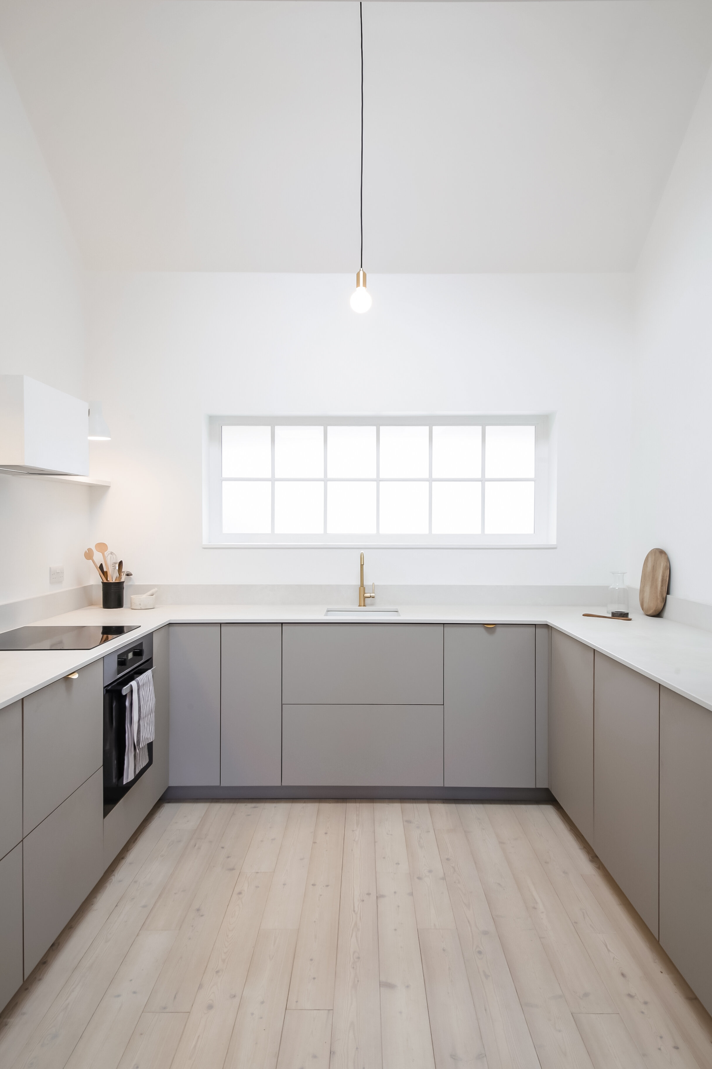
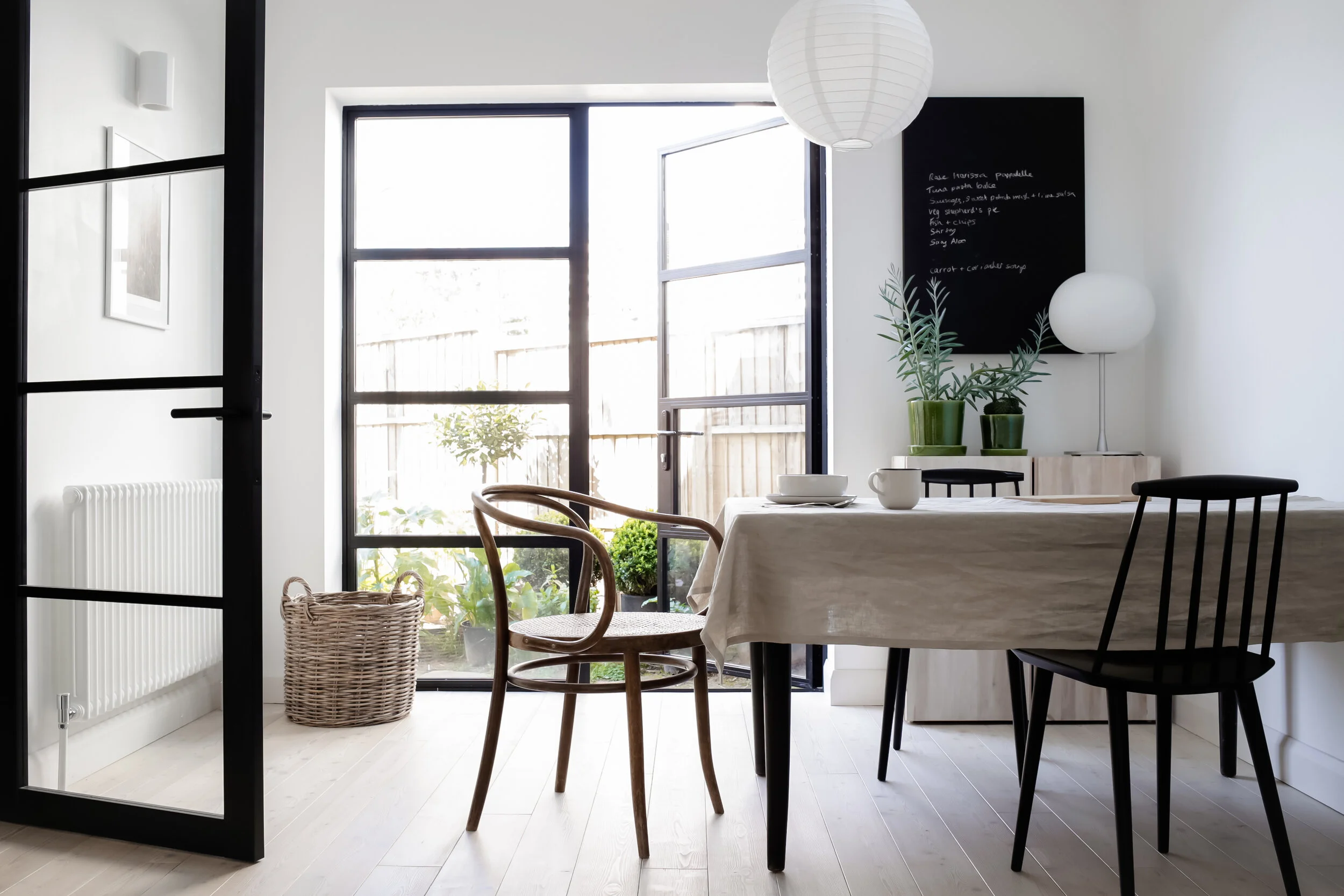
The internal space is enclosed by a high vaulted ceiling to the front and a flat roofed area to the rear. We added 3 roof lights to draw in light from different directions as well as a bespoke feature window above the sink to the front of the space and crittall style doors opening out onto the garden at the rear. The doors were supplied and fitted for us by Cherwell Windows and they are from the Aluco Elegance range. Eventually they will lead out to a decked area. We’d love to complete the garden this year if possible, and this will be our next project when supplies become available again and we can order the materials we need.
The glass for the front window was ordered from a local supplier and Graham constructed a bespoke timber frame. We modelled this on a 1930s style garage door to fit in with the external style of the property and from the front of our house you could almost think that the new extension is actually a garage. We like the element of surprise you get when you enter the property and discover that it’s actuallly a really lovely space rather than a humble garage though. We had the roof clad in reclaimed tiles and as one of the neighbours was kind enough to comment ‘it looks as though it could have always been there’.

Planning the layout of our modern minimalist kitchen
When planning a new kitchen there is a lot of unseen functional stuff you need to consider before you can even begin to think about designing the visual elements. This is the unglamorous part of any project but it’s actually crucial to getting the space right. You need to think about where all the services and utilities go – the plumbing, heating, sockets and switches etc. This needs to be decided at a very early stage in the project as it’s not always possible to change your mind later.
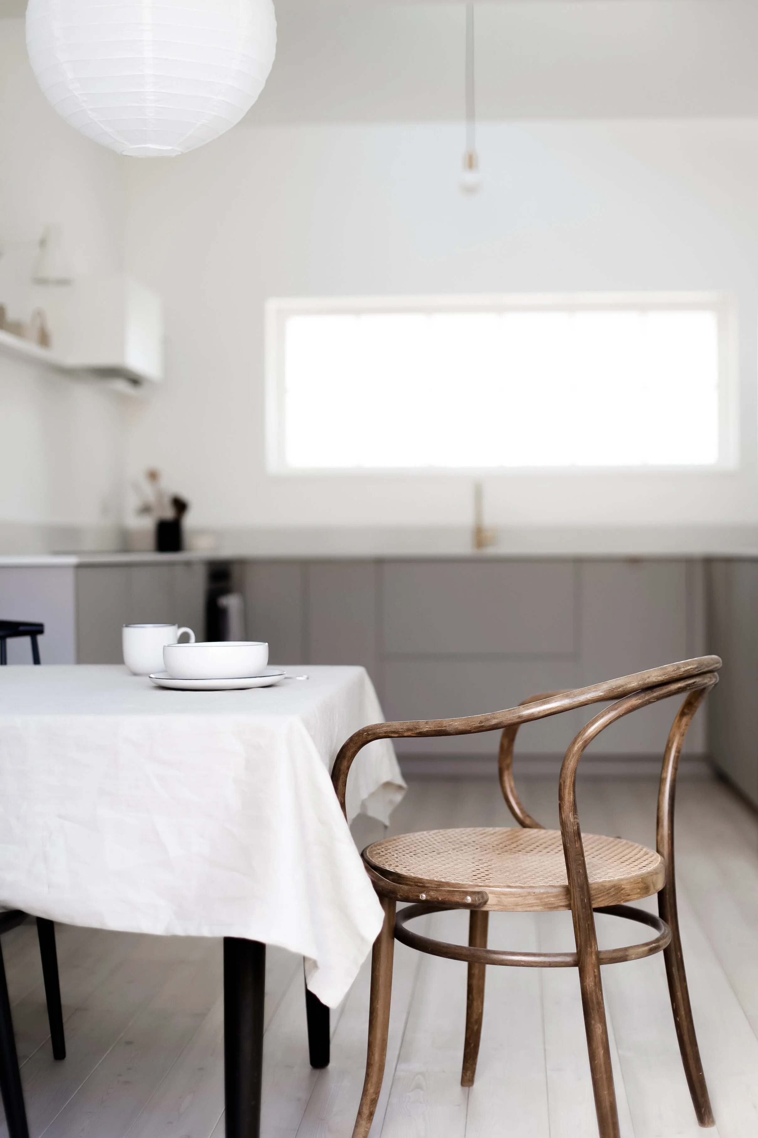
When we started looking at the dimensions of the space we realised that it couldn’t easily accommodate an island. We could possibly have squeezed one in at a push but it would have been tight and probably wouldn’t have been the best use of the space. In our previous house we had an open plan kitchen living area with a peninsula that separated the kitchen from the living area. It worked well and it was something we did consider for the new kitchen. In the end though we were guided by our design to keep the space feeling as open and spacious as possible and we opted for a u-shaped design with just a few open shelves, a custom built extractor cover and no full height units.
We’d decided to buy the base units from IKEA and then order custom doors and drawer fronts so we literally started with a blank piece of paper and sketched out design layouts and ideas until we came up with one we were both happy with. We then booked an appointment with a very helpful kitchen designer at our local IKEA store and he drew up the plans to our design.

The budget for our kitchen extension
For anyone wondering about our budget I can’t really provide an accurate costing for the project because we saved a huge amount on labour by doing pretty much everything ourselves. This wasn’t a cheap build – we wanted to achieve a high quality finish and attention to detail was something that was really important to us – but as a rough estimate I would guess that we probably saved around 40% of the cost of the internal fit out by undertaking the work ourselves. This meant that we were able to afford a much more high spec kitchen than would otherwise have been within our reach.

Choosing the flooring for our kitchen extension
We’d originally considered using the oak parquet we used in the lounge and hallway in the kitchen. Usually I would recommend using the same flooring materials throughout to create a natural sense of flow throughout different parts of the house but I chose not to follow my own advice here. This was a gamble but I think it paid off. Instead we opted for larch flooring. There were two reasons for this. The first was cost. We loved the oak parquet but it was expensive and we’d already overspent in more areas of the house than we originally intended. The second reason was that the new extension actually feels like a different part of the house from the old part once you step inside. It has a light, airy, modern, minimalist feel and we wanted to choose flooring that reflected that. We bought untreated larch and I applied lye and an Osmo oil finish to create the look we wanted. The process was similar to one that we’d used previously on the flooring upstairs in the bedrooms. It’s a time consuming and labour intensive process, but it did allow us to achieve the exact colour and finish we wanted. Larch is technically a soft wood and not often used for flooring but although it’s not as hard as oak it does stand up to more wear and tear than standard softwood floorboards. Several months on I’m pretty pleased with how it’s coping with general day to day use. It’s light so it does get dirty, but it cleans up really well with a bucket of soapy water and a mop and it looks amazing.

The Kitchen Cabinets
From the outset we had quite a clear idea about the form we wanted this space to take. We wanted it to feel light, airy and minimal, but when it came to deciding on the cabinets it took us much longer to arrive at a decision. Initially I mulled over the idea of traditional shaker style cabinets with a marble effect worktop. I felt this would suit our 1930s house, but although I love this style I also wondered if it might be a little too ‘safe’ as a design choice. While it’s a tried and tested look that works well and is popular for a reason, we both wanted to create something that felt a little more individual to us rather than a cut and paste version of a kitchen we had seen elsewhere.
After deciding to order the base units from IKEA we specified custom doors and drawer fronts from Husk. If some of you are interested in the process of ordering bespoke fronts for IKEA units maybe I can write a separate post on this at a later date? Husk helped guide us through the process and provided lots of useful advice and and we were really impressed with the quality of the doors and drawer fronts when they arrived.
If you’re thinking about going down the custom door route my advice would be to take your time, get as many colour and material samples as possible and use them to create a physical moodboard that you can touch, feel and play around with. Think about the worktops, the flooring, the finish of the taps. Don’t rush into making a decision. We lived with the moodboard for a couple of weeks to see how we felt about it and how the samples looked in different light and at different times during the day. In the end it took us a little longer than originally anticipated to commit to a choice for the cabinetry, but it was the right thing to do because by taking our time we avoided making a potentially costly mistake. Only when we were 100% sure that we’d got it right did we go for it.
The doors and drawers are made of plywood and have a matt, soft touch, anti fingerprint FENIX surface. We decided to go for an oak trim on the edges which gives them a slightly more luxe feel (although the sample Husk sent with the exposed ply edge also looked great). We also opted for a handleless finish, so the doors and drawers are push to open (with the exception of the dishwasher cabinet and the cutlery drawer which we use all the time so a pull handle is just slightly quicker and easier). We love the clean lined, minimalist look this gives the kitchen.

The Worktops
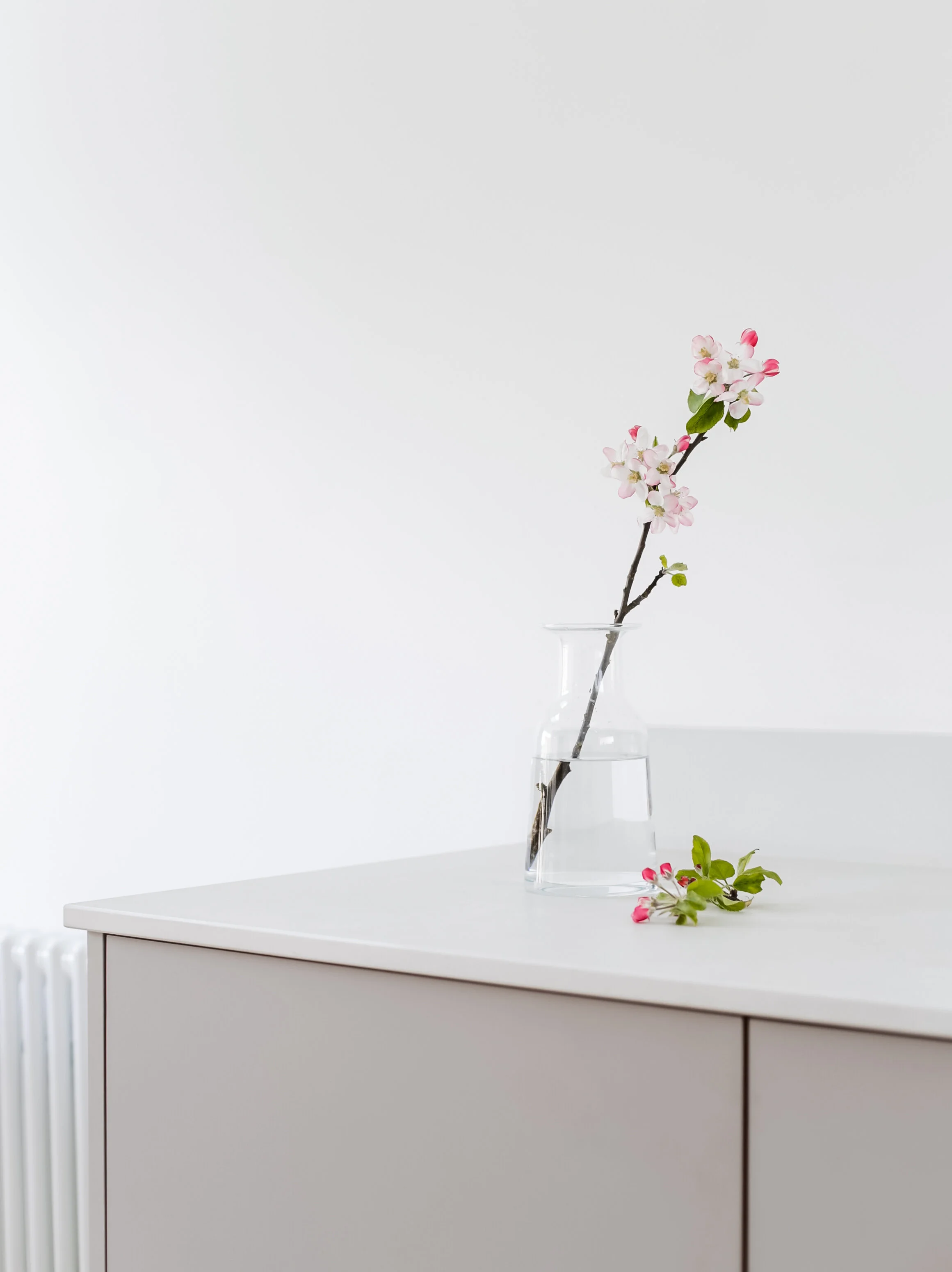
We worked with Caesarstone on this project and they kindly supplied the worktop which is Cloudburst Concrete from their Metropolitan collection. We visited their showroom in North London so that we could see big expanses of the different surfaces they offer rather than just a small sample. This is something I would definitely recommend doing before you commit to your worktop surface. Sometimes during the design process it pays to be open minded rather than remaining rigidly fixated on an initial idea. We’d originally been leaning towards Statuario Maximus from the Caesarstone Supernatural collection, but we took a sample of our flooring and cabinet colour and finish with us when we visited so that we could see what the worktops would look like next to them and we ended up changing our mind. We loved the striking veined effect of Statuario Maximus but in the end felt that the contemporary, industrial feel of Cloudburst Concrete was just a bit more ‘us’. The subtle tones worked perfectly with the other elements we’d already chosen for the kitchen and it just instinctively felt right. When the fabricators arrived to fit the worktops we immediately knew we’d made the right choice. We opted for a 20mm worktop with just a simple upstand to keep the design clean, minimal and understated. A big thank you to Caeasarstone for their support and also to Bellaggio who we hired to do the fabrication.


The Sink and Taps
Having opted to keep the overall look very minimal the choice of tap was really important to us because more of your attention is drawn towards it. We opted for the Althia single lever mixer tap by Abode, and it essentially acts a piece of jewellery in what is otherwise a very pared back, unembellished space. The tone of the brushed brass finish is beautiful, slightly desaturated and not too ‘yellow’. It really completes the room. Along with the ceramic undermounted sink this was very kindly supplied by Abode.


The Kitchen Appliances
We chose a Miele oven and a Bosch slimline integrated dishwasher. We’d originally considered just having a counter level integrated fridge and freezer (as we had in our last house) as we wanted to keep everything at counter level to keep things feeling light and open, but at the same time we both really longed for the luxury of a big American style fridge freezer. When we started looking at them we were a bit daunted though – they are often huge and we didn’t want the fridge to completely dominate the space. And then we found this one from Fisher & Paykel which is slightly more compact than most of the other models we looked at but still provides ample space for the two of us. It felt like a huge extravagance, but because we’d saved so much on some of the other elements by doing the work ourselves we decided to treat ourselves. And honestly it was one of the best decisions we’ve made. It makes cooking and meal planning more enjoyable and keeps food fresh for so much longer. No more throwing out a bag of lettuce after two days! While we have been in lockdown I have been so thankful to have a fridge freezer large enough to store two weeks worth of provisions so that we don’t have to head out to the shops regularly to ‘top up’ on essentials. We absolutely love it!!

The Lighting
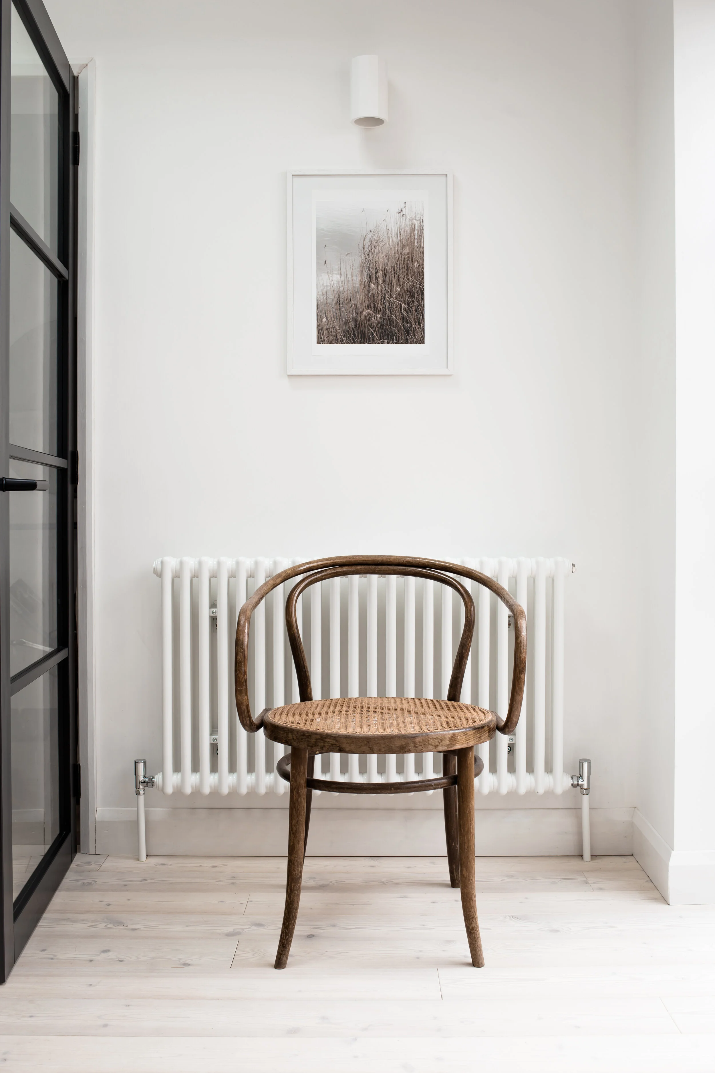
When it came to the lighting we again kept things very minimal. The wall lights above the shelving are by Anglepoise and the light above the picture is by Astro. For the pendant lights we chose a matt white bulb in a brass fitting by Tala and a simple paper lantern. We may replace this at some point but it does the job for now. Simple is often best.


We are so proud of what we have achieved with this space. The quality of the natural light in here is just beautiful which makes it a great space for photography – I’m really looking forward to using it for my work over the coming months. Mostly though it’s just a really lovely place to spend time in.
To anyone currently in the midst of a kitchen renovation or extension project and feeling that it will never end, trust me, it will all be worth it. For us, this has been a long project. It wasn’t our first renovation – we learned some key lessons and skills undertaking work on our old house so we weren’t complete novices – but it took its toll at times. When we first started work on this space more than a year ago we could never have imagined how important it would become to us though. I’ve always believed that our homes should be a place of sanctuary and never has that been more true than during the past few weeks. This space uplifts me and fills me with a sense of light and calm every time I enter it. So many things are beyond our control at the moment but baking and preparing healthy meals in this beautiful room we’ve created feels like something I can take charge of. Right now I need that and I am beyond grateful for it. Sometimes good design really can be life enhancing.

Planning your own project? Check out these 21 stunning ideas for kitchen extensions.
Source list
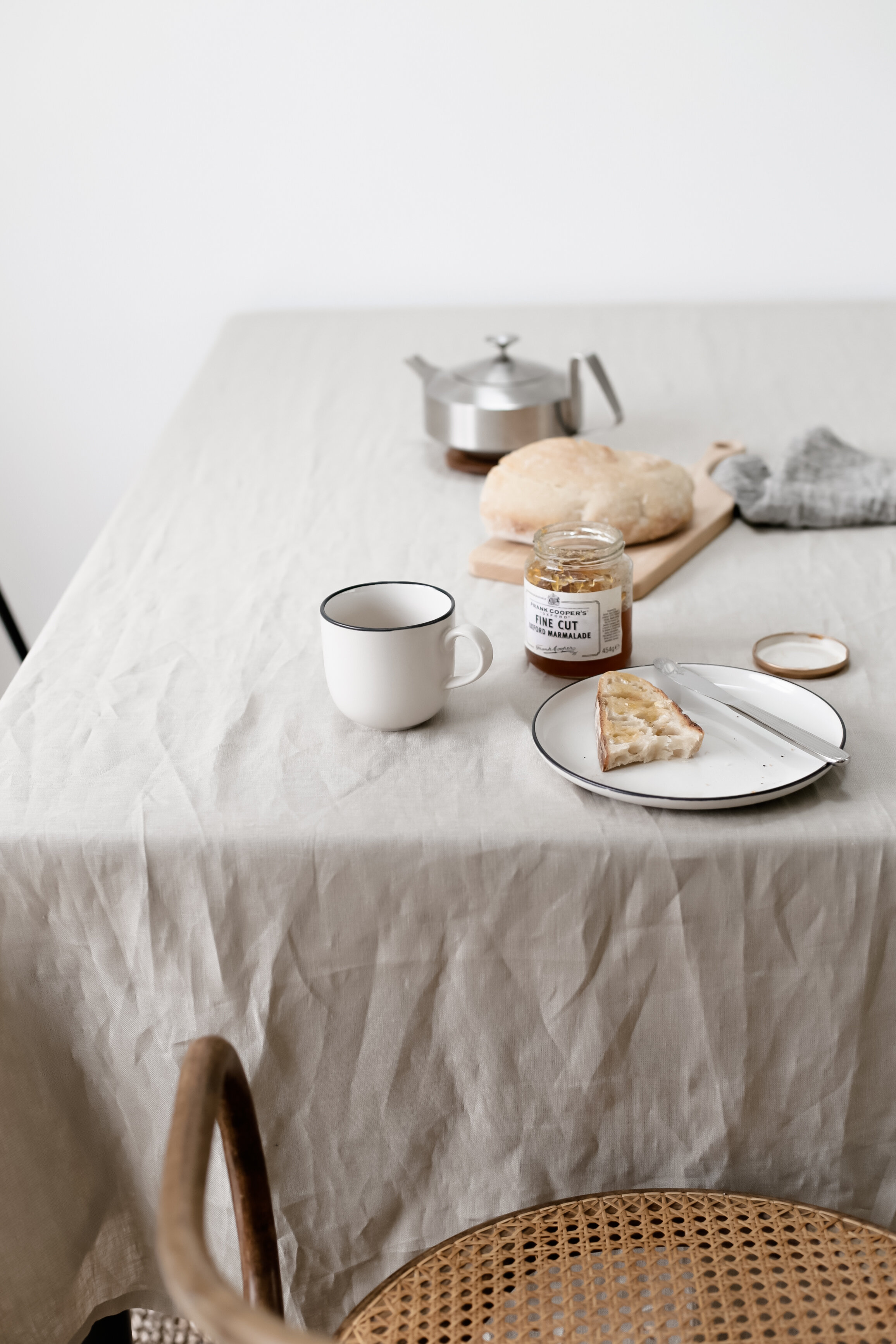
worktops – Caesarstone* | worktop fabrication – Bellagio | tap – Abode* | sink – Abode* | door & drawer handles – Superfront | flooring – Russwood | cabinets – IKEA base units with custom door and drawer fronts by Husk | black patio doors – Cherwell | glazed black internal door – Doors to You | dining table – vintage | black dining chairs – Hay | cane bentwood chair – vintage | pendant light – Tala | oven – Miele | fridge – Fisher & Paykel | wall lights – Anglepoise | glass decanter – Skagerak* | teapot – Robert Welch (vintage) | tableware – M&S*
Ad disclosure – We worked with Caesarstone and Abode on this project. Items marked * were kindly supplied by the respective brands.
All images © Helen Powell.


